
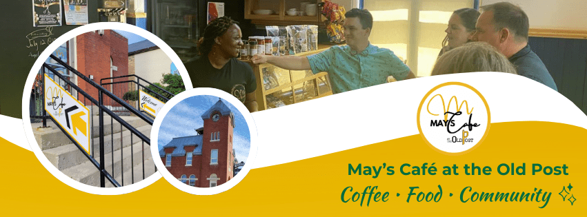
Introduction:
In this case study, we explore the design process undertaken at May’s Café, focusing on the challenges faced and the innovative solutions implemented to enhance customer experience and operational efficiency. Through a structured yet adaptive design approach, this project evolved from fragmented systems into a cohesive, visually driven brand and operational framework.
Throughout this three-month project, I worked directly with the café owner in a fast-paced environment, balancing day-to-day design needs with long-term system building. My role expanded from creating individual assets to developing cohesive operational and visual systems, while adapting to tight deadlines, evolving feedback, and the realities of designing for a small business.
Problem:
At the start of the project, May’s Café operated without clear systems for both internal processes and external communication. Recipes and workflows were inconsistently documented, often relying on verbal instruction, while menus and design materials lacked structure, hierarchy, and visual consistency. On the customer-facing side, social media content felt fragmented and repetitive, without a cohesive brand direction. Combined with limited time, evolving expectations, and incomplete design briefs, these challenges created inefficiencies in daily operations and made it difficult to present a clear, unified brand experience.
The Challenge:
A key challenge throughout this project was working within a fast-paced environment with limited direction and evolving expectations. Many tasks were assigned without fully defined briefs, requiring me to ask clarifying questions while continuing to make progress independently. Tight timelines often required same-day deliverables, leaving little room for extended planning or iteration. Additionally, information such as recipes and content details was not always readily available, making it necessary to design while simultaneously gathering and organizing information. Balancing speed, accuracy, and design quality in this context required adaptability, strong communication, and confident decision-making.
Solution:
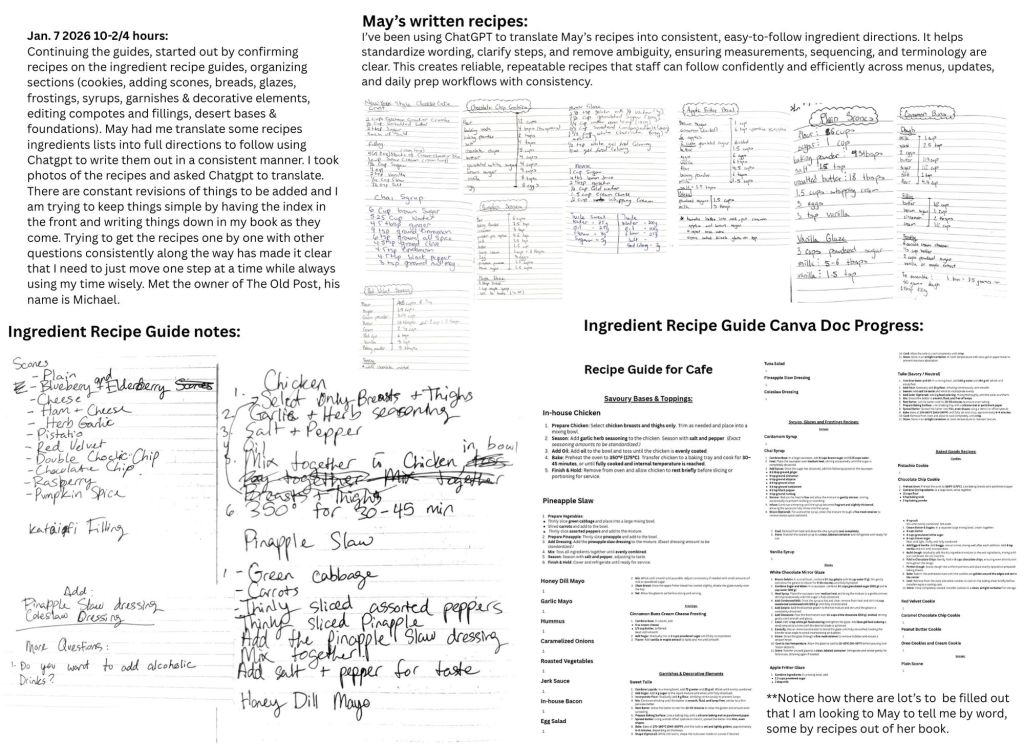
To address these challenges, I implemented a systems-based design approach that focused on both operational clarity and visual consistency. This included developing standardized employee guides and recipe documentation, redesigning menus with clear hierarchy and improved readability, and creating flexible, reusable templates for social media content. I also shifted the visual direction toward a more image-driven approach, prioritizing real photography to better reflect the café’s products and atmosphere. By combining structured systems with adaptable design solutions, I was able to support both the day-to-day needs of the business and its long-term brand development.
The Opportunity:
These challenges revealed an opportunity to introduce structure, clarity, and consistency across both operations and branding at May’s Café. By developing standardized systems for recipes and employee guides, alongside a cohesive visual identity and content strategy, the project could improve internal efficiency while strengthening the café’s external presence. There was also a clear opportunity to shift toward more authentic, visually driven content that better reflected the quality of the products and the community-focused atmosphere of the business.
The Strategy & Process:
The strategy for this project focused on building structured, repeatable systems that could support both the café’s daily operations and its long-term brand growth. Rather than approaching each task individually, I grouped the work into key phases that addressed foundational issues first, followed by scalable design solutions.
1. Research & Audit
I began by reviewing existing menus, recipes, and social media content to understand current workflows and identify inconsistencies. This revealed gaps in organization, repetition across materials, and a lack of clear visual hierarchy.
2. System Development
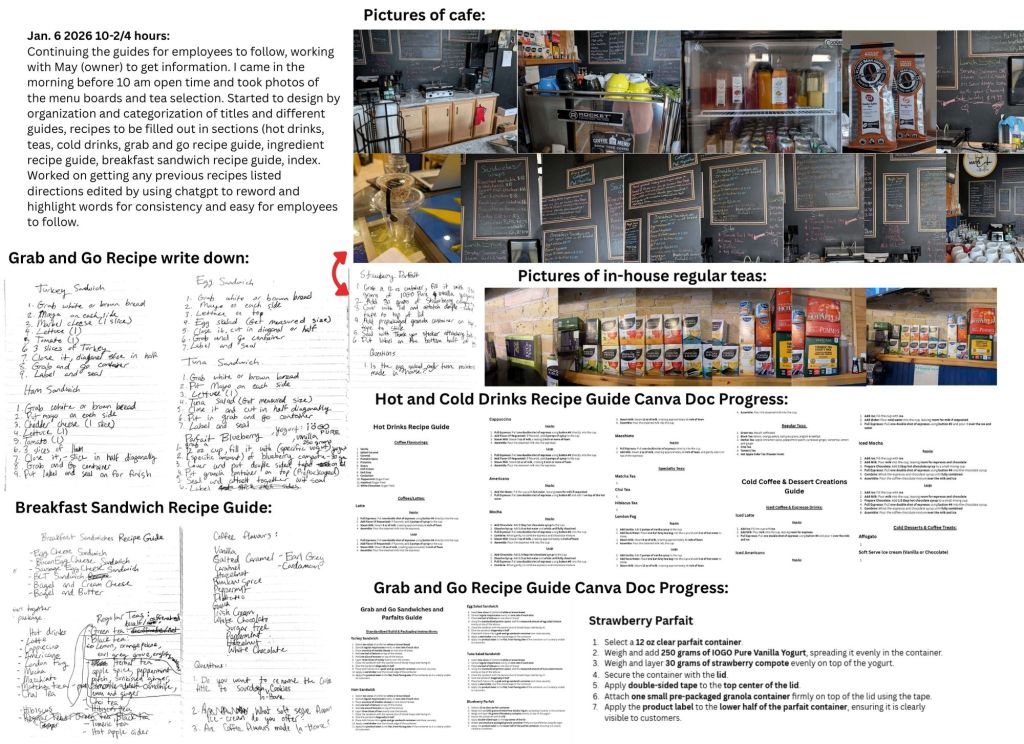
To improve internal efficiency, I created structured employee guides and standardized recipe documentation. This included organizing content into clear categories, translating handwritten notes into step-by-step instructions, and ensuring consistency in formatting and terminology.
3. Menu & Visual System Design
I redesigned the café’s menus with a focus on readability, accessibility, and consistency. Clear hierarchy, improved contrast, and simplified layouts were introduced to make information easier to navigate while maintaining the café’s visual identity.
4. Content & Template Creation
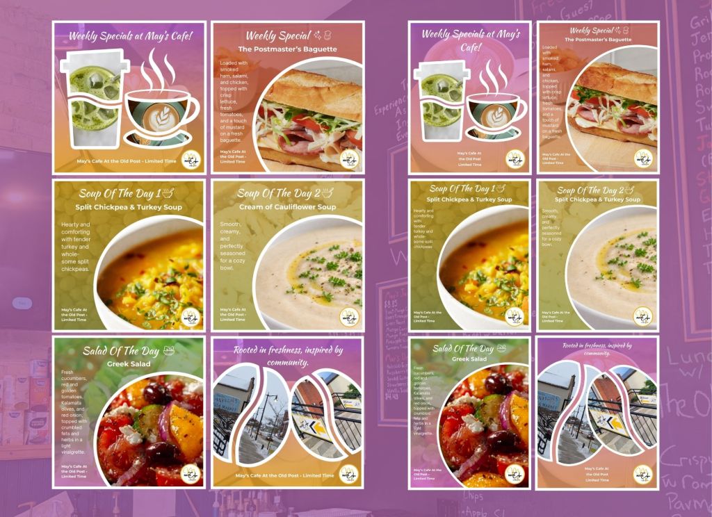
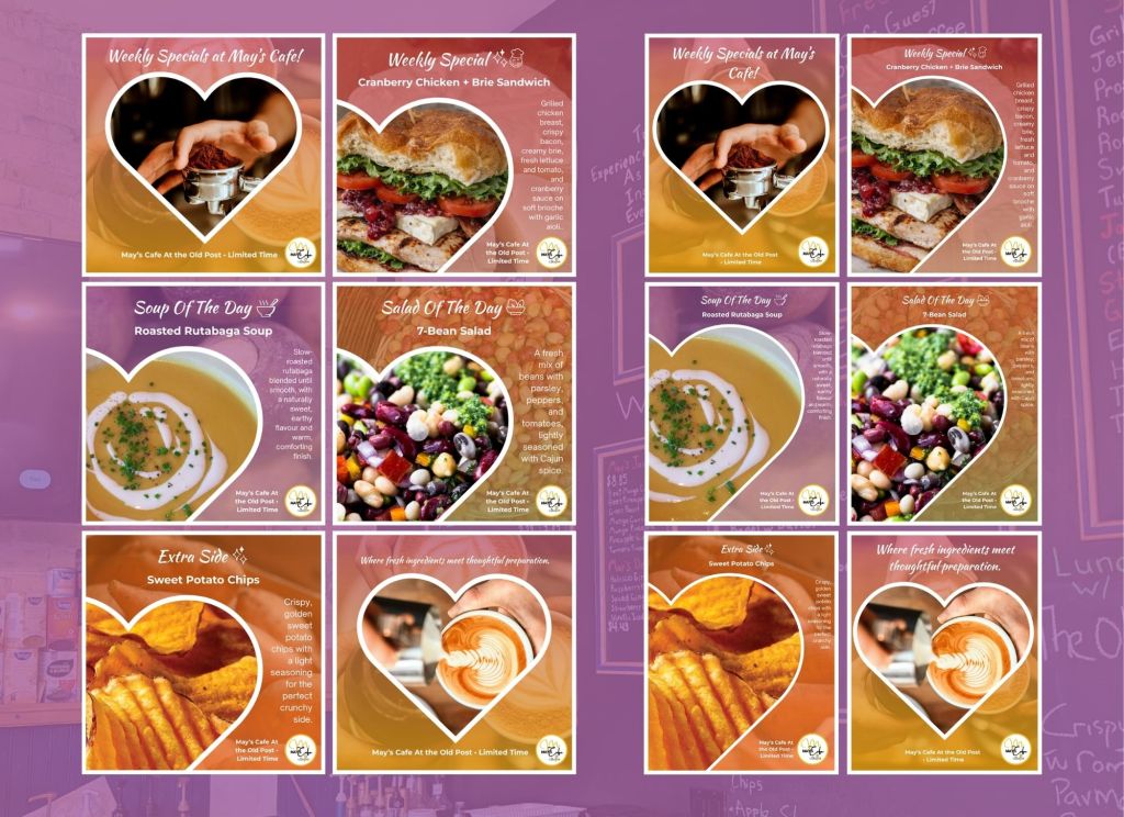
I developed a flexible content system for social media, including reusable templates for weekly specials, events, testimonials, and announcements. This allowed for faster content creation while maintaining a consistent brand presence across platforms.
5. Iteration & Optimization
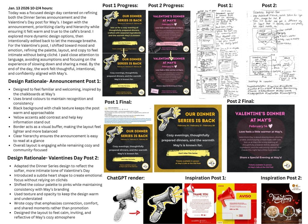
Throughout the project, I continuously refined designs based on feedback and real-time use. This included shifting toward a more visual-first approach, prioritizing real photography over stock imagery, and exploring varied layouts to keep content engaging and aligned with the café’s evolving direction.
This phased approach ensured that immediate needs were met while also building a foundation for long-term consistency and growth.
Constraints:
The project was shaped by several real-world constraints, including limited time, evolving direction, and access to information. Many deliverables required same-day turnaround, which reduced opportunities for extended planning and iteration. Creative briefs were often minimal or developed in real time, requiring me to interpret needs and adapt quickly based on feedback. Additionally, not always being on-site and working within a fast-paced café environment made it challenging to gather accurate information and capture content consistently. These constraints required a flexible, solution-oriented approach, balancing speed with thoughtful design decisions.
Content Evolution & Iteration:
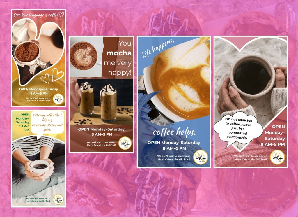
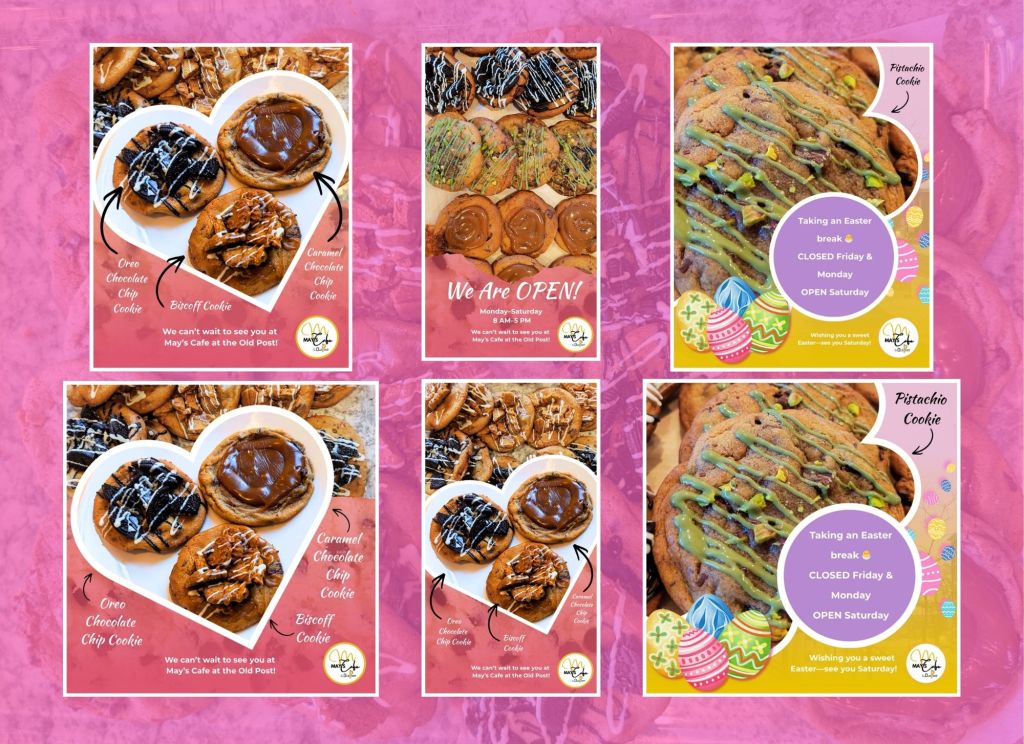
Content development throughout this project was highly iterative, shaped by ongoing feedback and real-time testing. Early designs focused on structure and consistency but were often too text-heavy and repetitive. Over time, the approach shifted toward a more visual-first direction, prioritizing real photography and simplifying layouts to better highlight the café’s products and atmosphere. Template systems were also adapted to allow more variation in composition while maintaining consistency. This process of continuous refinement led to more engaging, cohesive, and effective content.
Brand Voice & Tone:
The brand voice for May’s Café was developed to reflect its warm, community-focused atmosphere and the quality of its handmade offerings. The tone is welcoming, authentic, and approachable, emphasizing comfort, connection, and everyday moments. Messaging avoids overly promotional language, instead focusing on inviting customers into an experience, whether that’s enjoying a quiet coffee, sharing a meal, or being part of the café’s community.
Visually and verbally, the brand aims to feel genuine and human, using clear, simple language paired with imagery that highlights real food, real moments, and the people behind the space.
Visual Language:
The visual language combines warm colour palettes, soft gradients, and subtle textures to reflect the café’s inviting atmosphere. Large image frames prioritize food and in-café experiences, while simple motifs add personality without overwhelming the design. This approach creates a cohesive yet flexible system that supports both consistency and variation across content.
Reels (Video Content Strategy):
Reels played a central role in shifting the café’s content toward a more engaging, visual-first strategy. By focusing on process-driven and experience-based footage, such as making drinks, plating food, and capturing in-café moments, the content moved beyond static promotion to storytelling. This approach increased authenticity, improved viewer engagement, and helped communicate the quality and atmosphere of the café more effectively.
Tools & Methods:
A combination of design, content, and planning tools were used to support both creative development and workflow efficiency throughout the project.
Tools:
- Canva – design creation, template systems, and content production
- Meta Business Suite – scheduling and managing social media posts
- ChatGPT – refining copy, structuring content, and improving clarity
- Pinterest – visual research and design inspiration
Methods:
- Iterative design based on feedback and real-time testing
- Template-based systems for efficiency and consistency
- Visual-first approach prioritizing imagery over text
- Continuous refinement through observation and performance
Key Learnings:
This project strengthened my ability to design within real-world constraints, where time, communication, and evolving direction all play a significant role. I learned the importance of identifying business needs beyond the visual layer, and how structured systems can improve both efficiency and consistency. Working in a fast-paced environment also reinforced the value of adaptability, clear communication, and making confident design decisions under pressure. Overall, this experience shifted my approach toward creating design solutions that are not only visually effective, but practical and scalable.
Results:
This project resulted in a clear shift from fragmented processes to a more structured and cohesive system. Operationally, staff gained clearer guidance through standardized documentation, improving consistency in daily workflows. From a design perspective, the café developed a stronger, more recognizable visual identity with improved readability and hierarchy across menus and content. Social media became more consistent and engaging through the introduction of reusable systems and a visual-first approach, ultimately strengthening the café’s overall brand presence.
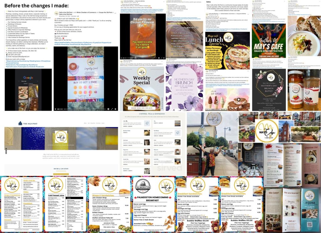
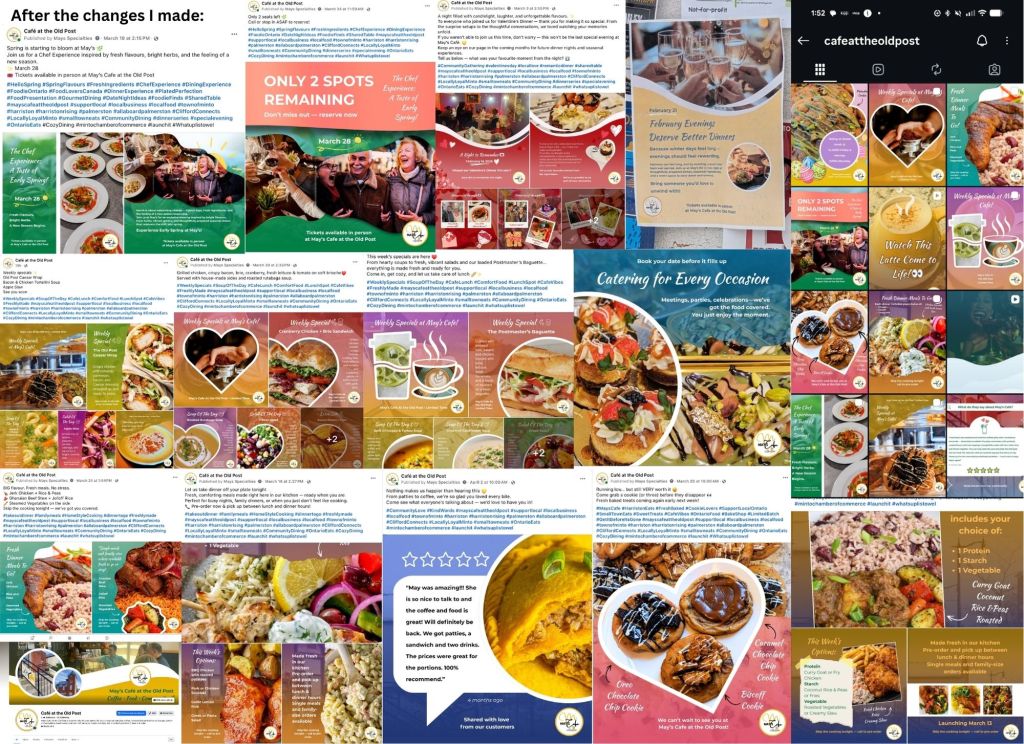
Before & After:
Before: Inconsistent layouts, unclear hierarchy, and text-heavy content made menus and posts difficult to navigate and visually disconnected.
After: Simplified layouts, improved readability, and a visual-first approach created a more cohesive, engaging, and brand-aligned experience across all touchpoints.
What I’d Do Next:
With more time and resources, the next step would be to expand the design system into a more comprehensive brand and customer experience strategy. This could include developing a simple website or online ordering system, refining a loyalty program, and introducing a user-generated content approach to encourage customer participation and community engagement.
I would also continue building out the visual system by creating more structured guidelines for layout, photography, and tone, ensuring long-term consistency across all platforms. Additionally, exploring in-café touchpoints—such as signage, printed materials, and environmental design—would help create a more cohesive and immersive brand experience both online and in person.
Conclusion:
This project demonstrates how thoughtful, systems-based design can bring clarity, consistency, and structure to a small business environment. By addressing both operational challenges and visual inconsistencies, I was able to create solutions that improved daily workflows while strengthening the café’s overall brand presence.
Through a combination of adaptability, iteration, and strategic thinking, the work evolved into a cohesive system that supports both immediate needs and long-term growth. This experience reinforced the value of designing not just for aesthetics, but for functionality, efficiency, and real-world impact.
