
Prologue:
Rooted in personal experience and storytelling, Water In My Ears is an awareness campaign platform that shines a light on the challenges and resilience of growing up with hearing loss. Built as an accessible website, the project combines illustration, narrative, and design strategy to connect with children, parents, and educators. More than a campaign, it is an evolving platform that will expand into a comic book series, transforming lived experience into a resource that fosters empathy, inclusion, and understanding.
Problem:
Hearing loss is an invisible challenge that often goes unnoticed, leaving children feeling isolated, misunderstood, and overlooked in classrooms and social spaces. Many students grow up without resources that reflect their experiences, while teachers and peers struggle to fully understand the daily barriers faced by hard of hearing learners. This lack of awareness can lead to frustration, exclusion, and missed opportunities for empathy and support.
Miscommunication → Classroom exclusion → Feelings of isolation → Limited representation in resources → Social + emotional struggles → Barriers to learning + confidence
The Challenge:
Children who are hard of hearing often face unique challenges that are rarely acknowledged or represented in mainstream resources. In classrooms, they can struggle with communication barriers, reliance on hearing technology, and the pressure to appear “normal.” These experiences are compounded by a lack of awareness among teachers, peers, and even families, leading to feelings of isolation and frustration. Without platforms that reflect their reality, young people growing up with hearing loss are left without tools that validate their experiences or help others understand them.
The Opportunity:
There is a powerful opportunity to use design as a tool for awareness and advocacy. Water In My Ears functions as a website awareness platform and resource that helps bridge the gap between lived experience and public understanding. By combining storytelling, illustration, and digital accessibility, the site creates a space where children with hearing loss can feel represented, while parents, teachers, and peers gain insight into the challenges they face. This tool not only raises awareness but also equips communities with knowledge to foster inclusion and empathy.
The Solution:
Water In My Ears is designed as a website awareness tool that brings visibility to the everyday experiences of growing up with hearing loss. Through illustration, storytelling, and accessible design, the platform provides a space where children can see their challenges reflected, and where parents, peers, and educators can gain meaningful insight. The site acts as both an awareness campaign and an educational tool—reducing stigma, building empathy, and helping bridge the communication gap that often isolates hard of hearing individuals.
The Strategy & Process:
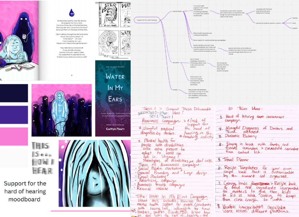
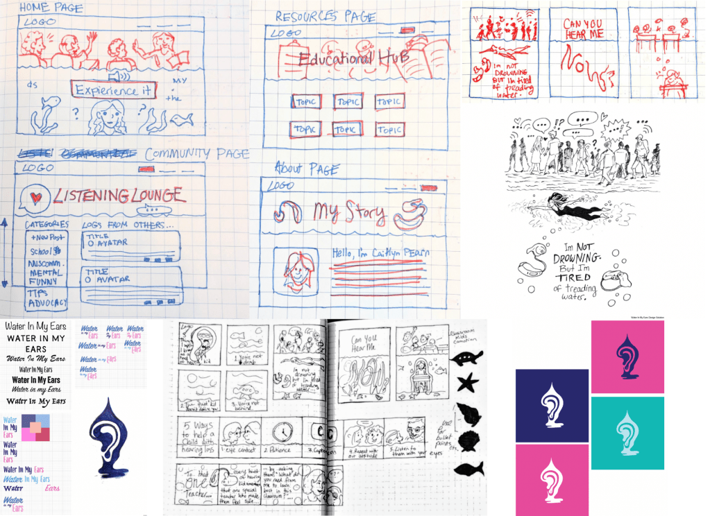
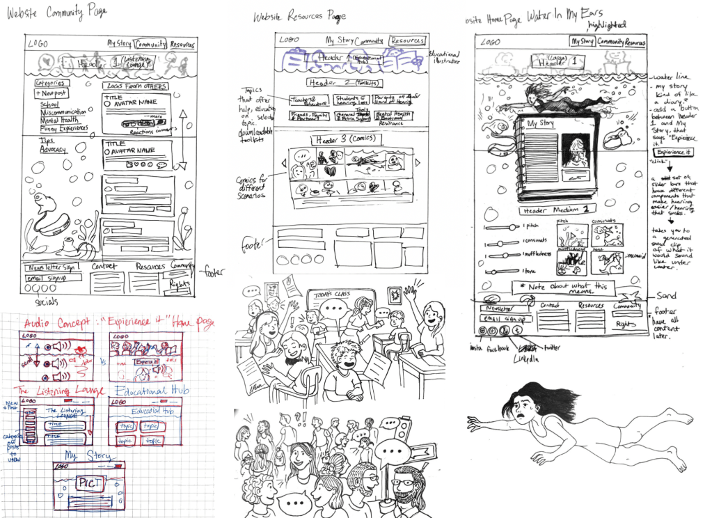
This project followed an iterative design process rooted in personal experience and research. Each decision—from the structure of the website to the use of illustration—was guided by the need to balance accessibility with storytelling. The visual design approach is clean and approachable, ensuring that the content feels welcoming rather than overwhelming. By combining sketches, narrative elements, and user-friendly layouts, Water In My Ears creates an online space that minimizes barriers, reduces miscommunication, and allows users to focus on the stories being shared.
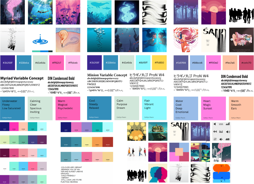
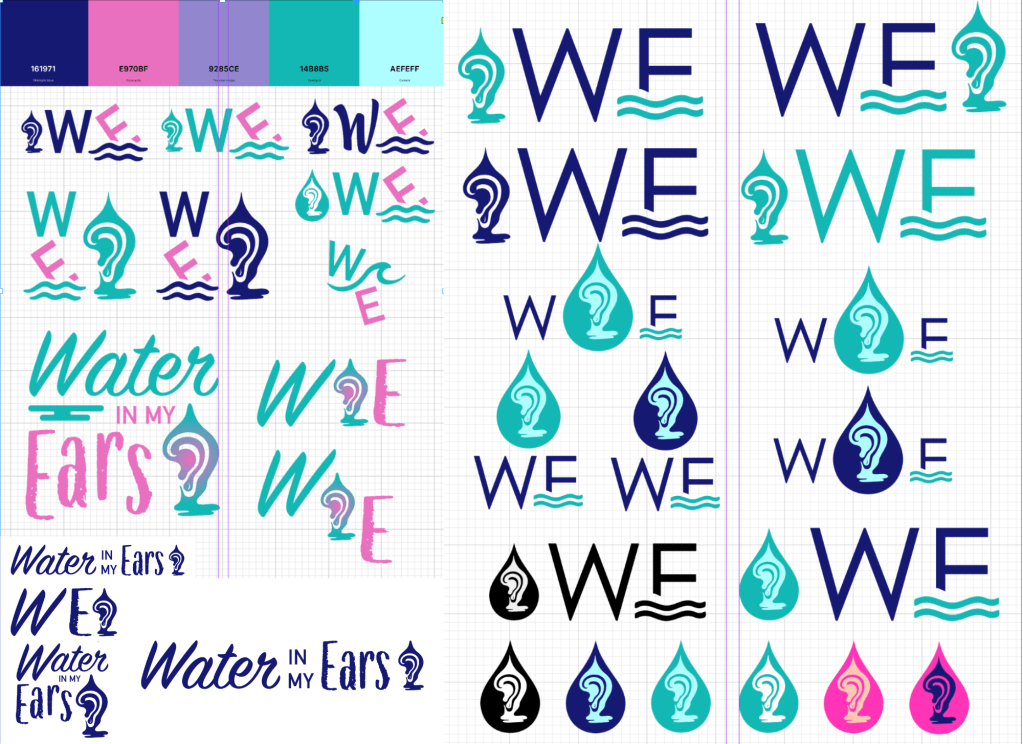
Visual Brand Strategy:
The branding strategy for Water In My Ears is designed to reflect both the weight and resilience of living with hearing loss. The use of soft gradients, aquatic-inspired textures, and layered illustrations communicates the feeling of being submerged, creating a visual metaphor for the challenges of listening and understanding in daily life. Clean typography ensures accessibility and clarity, while muted yet contrasting colors emphasize important messages without overwhelming the viewer.
Illustrations play a central role, grounding the campaign in personal storytelling and giving children, parents, and educators relatable imagery that sparks empathy. The combination of visual metaphors, approachable design, and bold storytelling elements creates a brand identity that is memorable, impactful, and true to the lived experiences it represents.
Web Design:
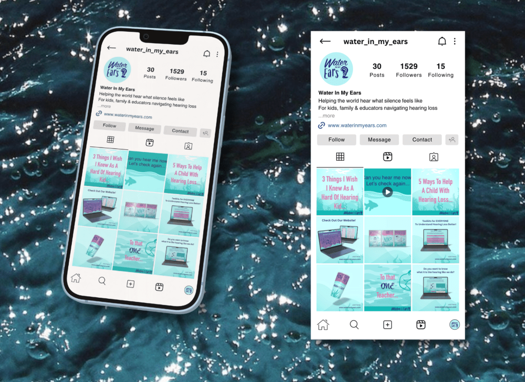
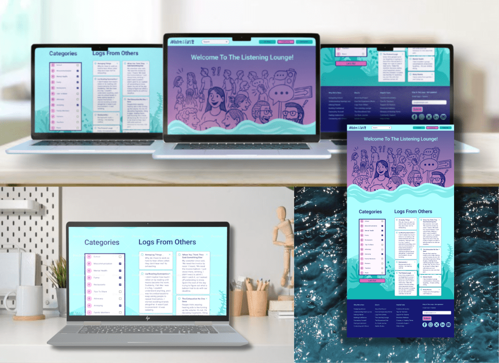
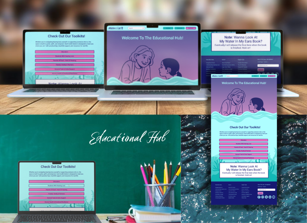
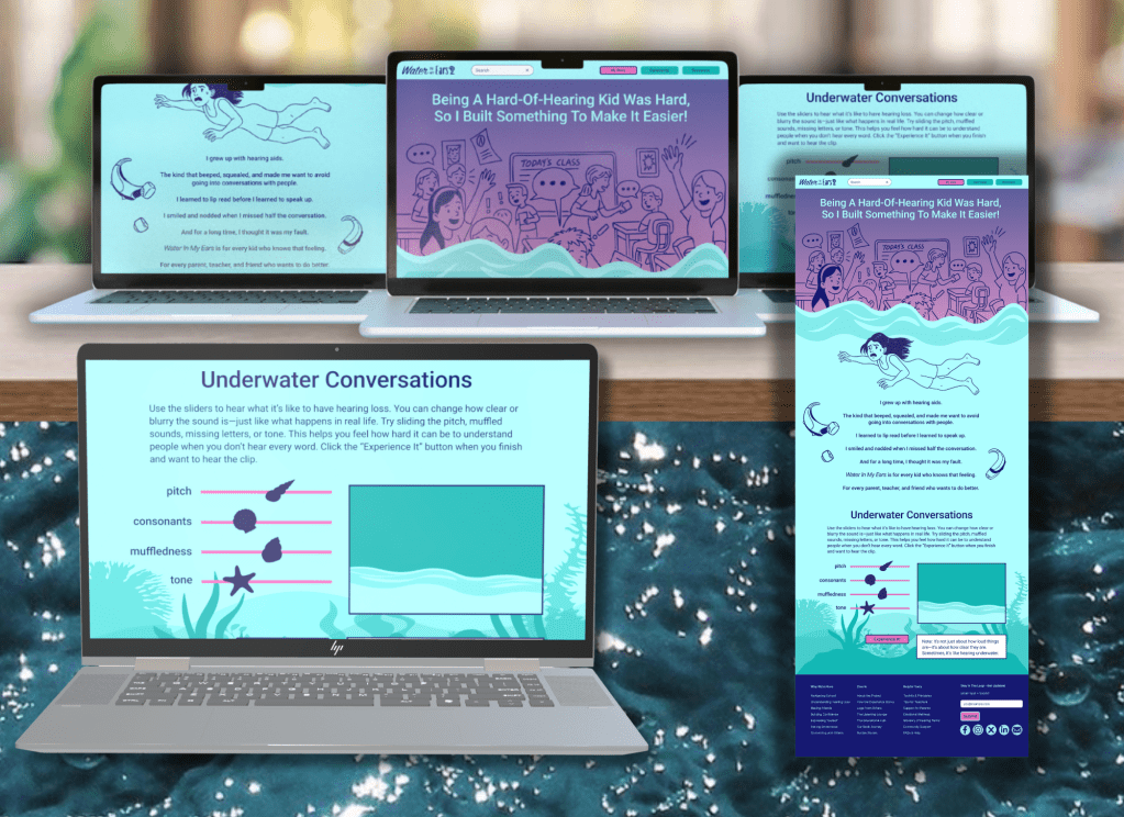
The Water In My Ears website is designed as an accessible awareness tool that blends storytelling with usability. Its structure emphasizes clarity and ease of navigation, allowing visitors to explore illustrated stories, educational resources, and advocacy tools without distraction. The layout uses intuitive sections—such as community stories, educational insights, and awareness visuals—to make the content approachable for both children and adults.
Color gradients and aquatic-inspired elements are integrated throughout the site, reinforcing the campaign’s central metaphor of feeling submerged in sound. Typography choices prioritize legibility, ensuring the platform remains accessible for a wide range of users. Together, these design elements create a digital environment that is empathetic, engaging, and purposeful, turning personal experience into a resource for awareness and inclusion.
Universal Design for Learning:
Water In My Ears is built on the principle that awareness tools must be inclusive and accessible to reach diverse audiences. Just as no two people experience hearing loss in the same way, the platform recognizes the need to communicate through multiple modes: storytelling, illustration, and digital accessibility. By blending visuals with narrative, the website ensures that children, parents, and educators can engage with the content in ways that feel relatable and meaningful, regardless of age, perspective, or prior knowledge.
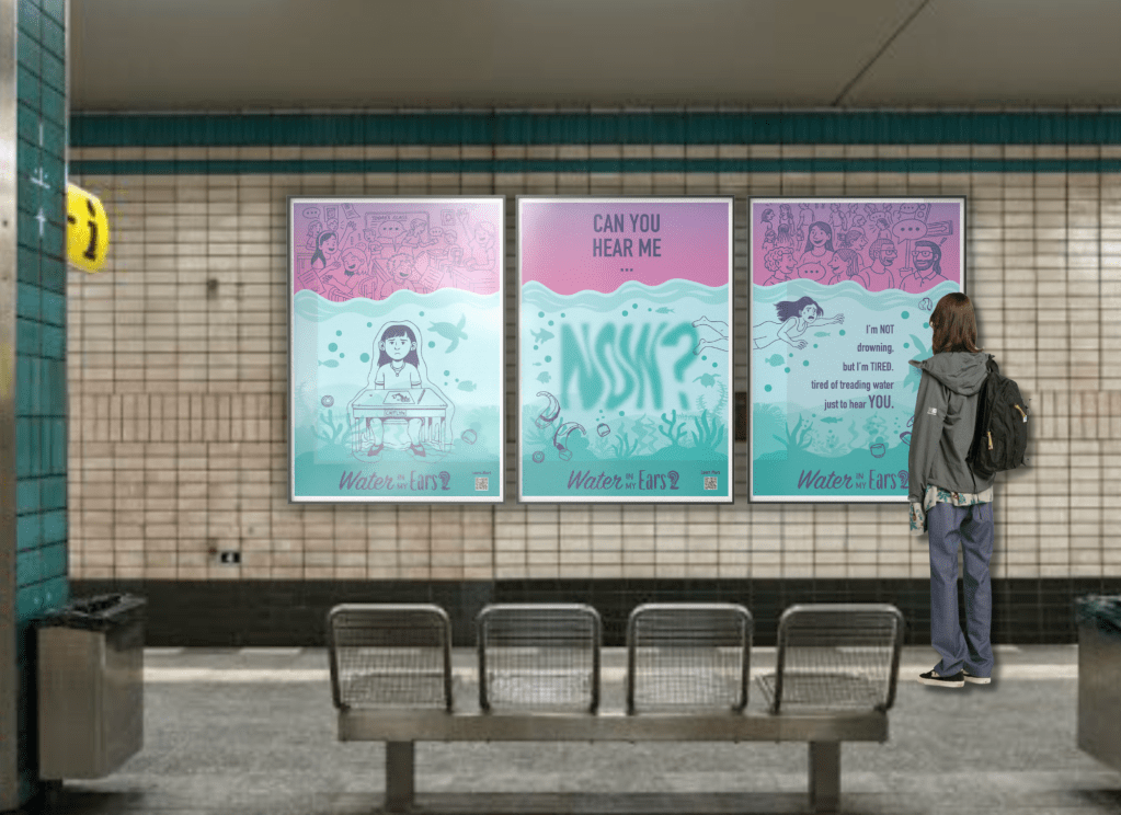
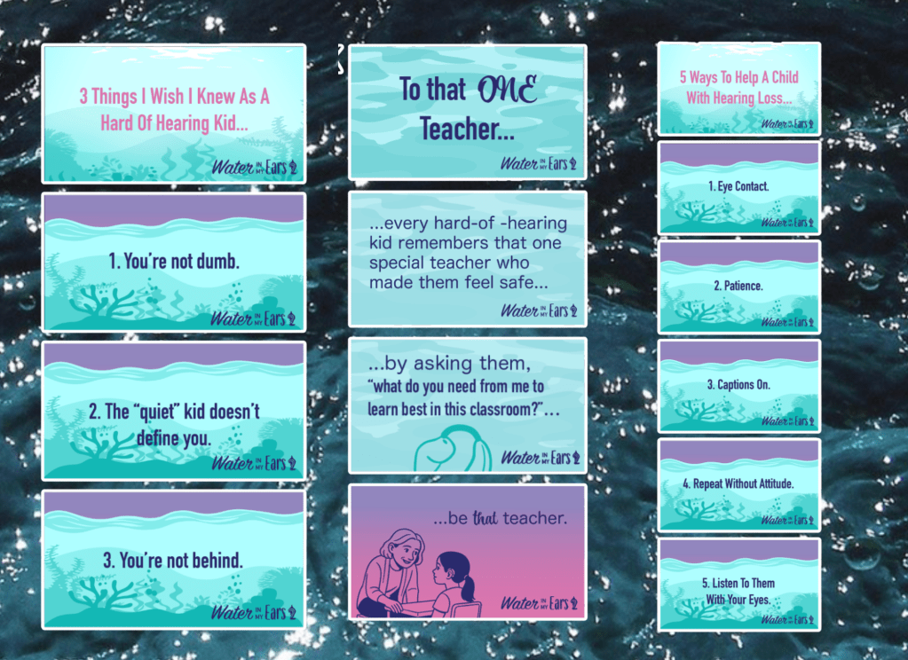
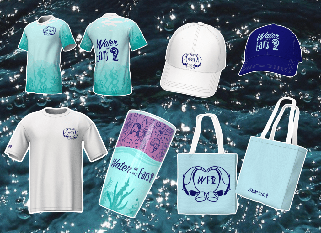
The Campaign:
To bring visibility to the platform, Water In My Ears extends beyond the website into an awareness campaign designed to spark empathy and conversation. Posters, illustrations, and digital assets highlight the unseen challenges of living with hearing loss, using metaphor and imagery to capture the emotional weight of everyday miscommunication. Paired with clear messaging, the campaign positions Water In My Ears as both a practical tool for education and a powerful voice for inclusion—validating the struggles of hard of hearing individuals while inviting others to listen and understand.
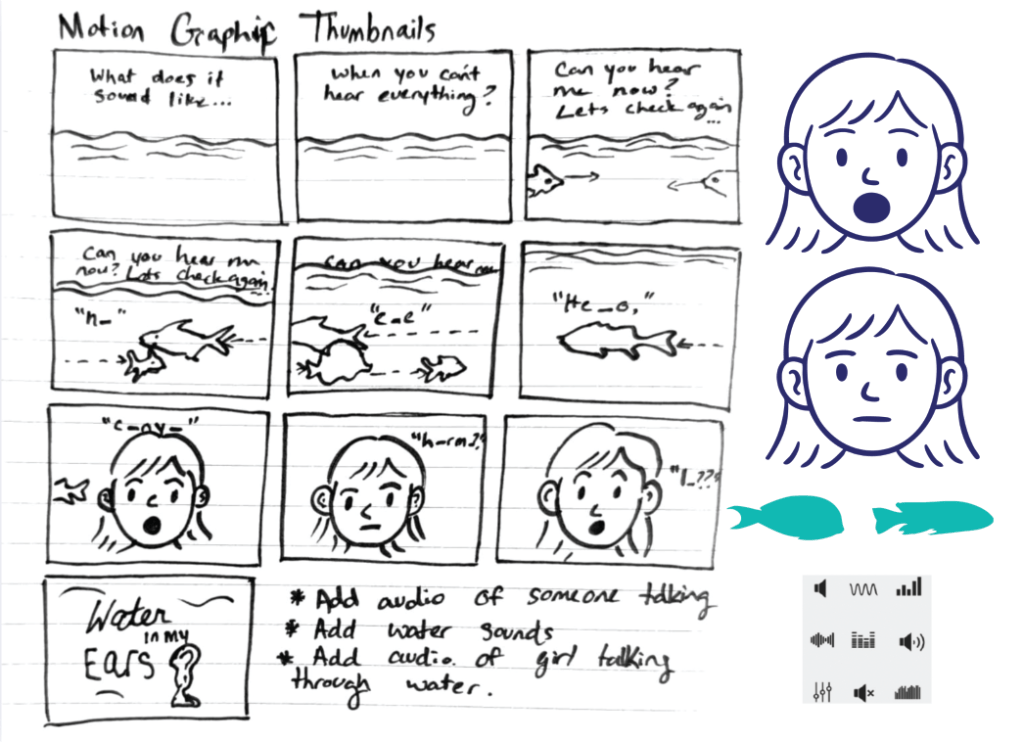
Motion Graphic:
The motion graphic for Water In My Ears is an underwater-inspired animation designed to replicate the listening experience of someone growing up hard of hearing. In the sequence, a girl speaks from beneath the surface, her words distorted, muffled, and broken apart by water. Layered sound effects, fluctuating clarity, and fragmented speech immerse viewers in the challenge of trying to follow conversation when hearing isn’t effortless. By combining illustration, sound design, and metaphor, the animation invites audiences to step into this perspective—creating empathy and a deeper understanding of what it feels like to navigate the world with hearing loss.
Download my full process book to gain deeper insight into the research, thesis paper, and design development behind Water In My Ears. It provides a complete look at the thinking, strategy, and creative process that shaped this awareness campaign and tool.
