Prologue:
Salted Symphony Pretzels is a conceptual snack brand that blends the joy of food with the creativity of music. Inspired by the harmony between flavour and experience, the brand identity plays on musical notes and instruments to position pretzels as more than just a snack—they become part of a performance. With bold visuals, playful typography, and a theme rooted in rhythm and creativity, Salted Symphony creates a unique space in the snacking market where indulgence meets imagination.
Problem:
The snack industry is crowded with brands that rely on generic packaging and repetitive messaging, often failing to capture consumer attention on the shelf. Pretzels in particular are marketed as simple, no-frills snacks, leaving little room for innovation or personality. This lack of distinctiveness makes it difficult for pretzel brands to stand out or connect emotionally with consumers. Without a fresh approach, pretzels risk being overlooked in favor of flashier, more memorable snack options.
Generic packaging → Weak brand differentiation → Limited consumer excitement → Market competition → Missed opportunity for storytelling and identity

The Challenge:
The pretzel market is saturated with products that often look and feel the same, relying on traditional packaging and branding that fail to capture consumer imagination. While pretzels remain a popular snack, they are typically marketed as simple and plain, which limits their appeal in a competitive snack aisle dominated by bold, creative brands. Without innovation in design and storytelling, pretzels risk being overlooked, blending into the background instead of standing out as a memorable choice.
The Opportunity:
Salted Symphony Pretzels introduces the chance to reposition pretzels as a fun, expressive, and premium snack experience. By pairing the familiar comfort of pretzels with a bold, music-inspired brand identity, the product captures attention and sparks curiosity. This creative direction not only differentiates the brand from competitors but also elevates pretzels into a unique category where food and creativity harmonize. With engaging visuals and thoughtful design, Salted Symphony transforms an everyday snack into something playful, memorable, and market-ready.
The Solution:
Salted Symphony Pretzels reimagines a classic snack through the lens of creativity and playfulness. By pairing pretzels with a music-inspired brand identity, the solution transforms a simple product into an experience that resonates with consumers both visually and emotionally. The brand uses bold packaging, whimsical typography, and consistent design elements to break through the noise of the snack aisle, giving pretzels a distinctive voice that stands out among competitors.
Through its memorable identity and cohesive packaging system, Salted Symphony positions itself as more than just another pretzel brand—it becomes a fun, engaging, and market-ready product that connects with audiences craving personality and authenticity in their snacks.
The Strategy & Process:
The development of Salted Symphony Pretzels followed an iterative design process that explored how to merge the familiar comfort of pretzels with the creativity of music. Early sketches and brainstorming focused on playful ways to integrate musical elements—like notes, treble clefs, and rhythms—into the logo and packaging. The process balanced experimentation with refinement, ensuring that the final concept felt fun and imaginative without overwhelming clarity or usability. By testing layouts, color palettes, and brand applications, the design evolved into a system that is both memorable and market-ready.

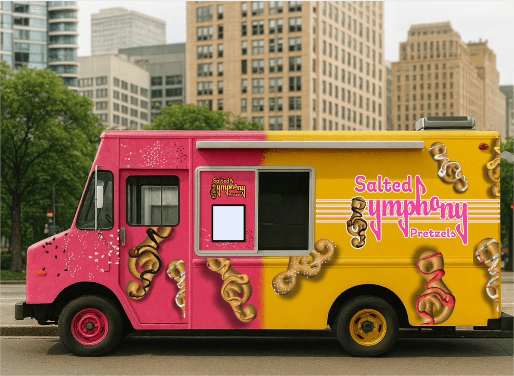
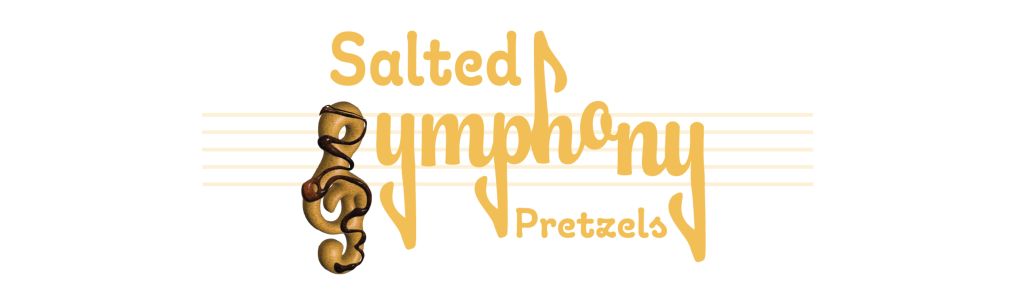
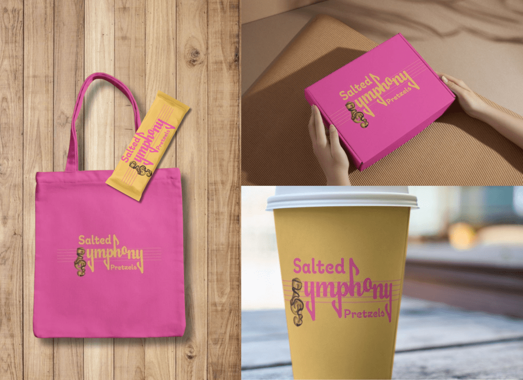
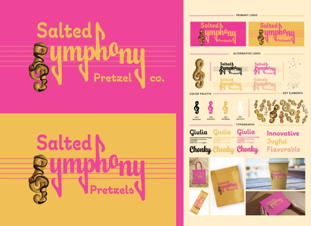
Visual Brand Strategy:
The branding for Salted Symphony Pretzels is designed to be bold, whimsical, and instantly recognizable. Using flowing, music-inspired typography, the logo connects the act of snacking with the joy of rhythm and harmony. A warm golden palette reinforces the pretzel theme while evoking energy and appetite, contrasted with playful accents that keep the identity approachable. Supporting visuals—such as treble clefs, notes, and rhythm-inspired graphics—extend across packaging and merchandise, reinforcing brand consistency. The overall strategy is to elevate pretzels beyond a simple snack, transforming them into a fun, expressive brand experience that sings off the shelf.
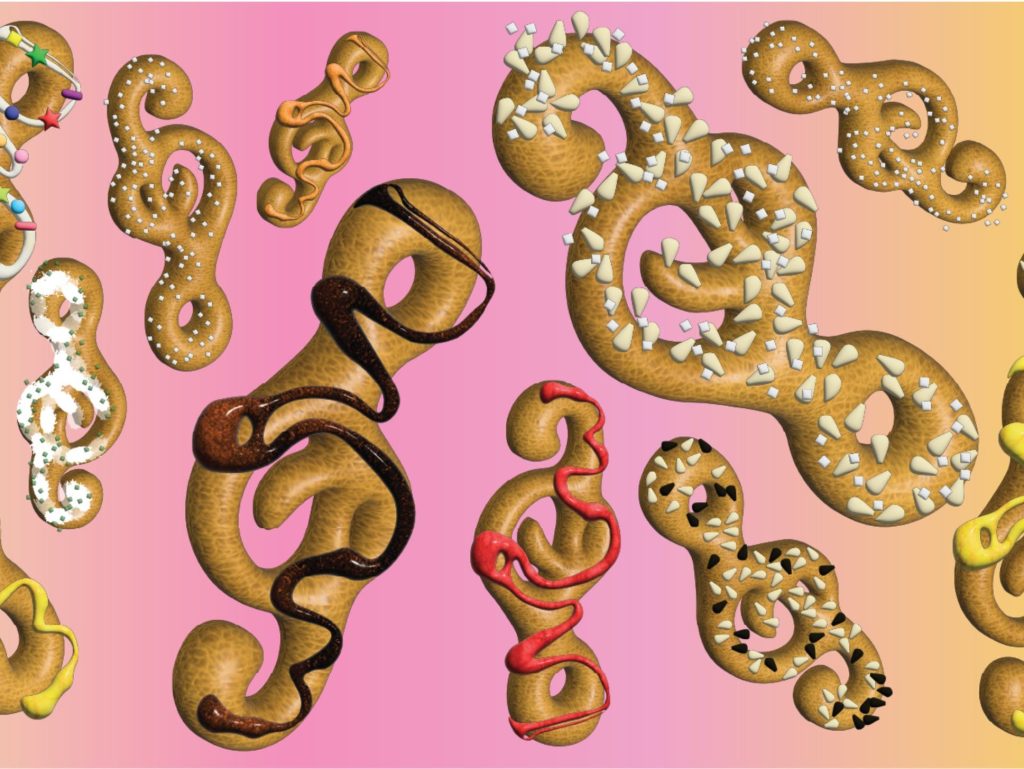
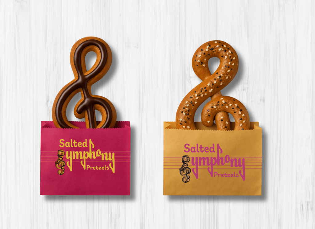
Pattern Design:
The Salted Symphony brand extends beyond its logo and packaging through a playful series of custom patterns. Inspired by treble clefs and musical notes, the pretzel-shaped forms are reimagined with textures, toppings, and drizzles to create a visually dynamic system. These repeating elements act as both a decorative motif and a storytelling device, reinforcing the connection between music and snacking.
The patterns are versatile and adaptable, appearing across packaging, promotional materials, and merchandise to maintain consistency while adding energy and movement to the brand. Bright gradients and bold toppings give the visuals a lively, celebratory feel, ensuring the brand identity remains fun, memorable, and instantly recognizable.