Prologue:
Rooted in community and comfort, The Golden Egg Diner is a concept designed to bring people together over fresh, hearty meals served in a welcoming atmosphere. Inspired by the charm of classic diners, the brand emphasizes simplicity, warmth, and quality. By blending nostalgic design elements with modern touches, The Golden Egg Diner creates a space where families, friends, and neighbors can gather to share not only food, but connection.
Problem:
Today’s dining landscape faces rising challenges: chain restaurants dominate the market, offering convenience but often at the expense of authenticity and quality. At the same time, many independent diners struggle to maintain a unique identity that stands out in a crowded industry. Consumers are increasingly looking for memorable dining experiences that feel personal, genuine, and worth returning to—something many establishments fail to deliver.
Fast food competition → Loss of authenticity → Generic dining experiences → Customer disengagement → Decline in local loyalty

The Challenge:
In today’s dining landscape, many independent diners struggle to stand out against chain restaurants that emphasize speed and low cost over quality. Customers are often met with generic menus, inconsistent service, and environments that lack character. As a result, diners face the challenge of staying relevant while delivering a memorable experience that keeps people coming back.
The Opportunity:
The Golden Egg Diner has the opportunity to fill this gap by offering more than just a meal—it provides an experience rooted in warmth, authenticity, and community. With a focus on comfort food made with care, paired with a welcoming atmosphere, the diner can establish itself as a local staple. By prioritizing quality, consistency, and charm, The Golden Egg Diner has the chance to foster loyalty, attract new patrons, and become a place where people gather not only to eat, but to connect.
The Solution:
The Golden Egg Diner positions itself as more than a restaurant—it’s a community hub designed to bring people together over timeless comfort food. By blending the nostalgic appeal of a classic diner with modern branding and consistency, it creates a distinctive identity that stands apart from generic competitors. The solution lies in offering approachable, high-quality meals in an inviting environment that emphasizes warmth, personality, and memorable service.

The Strategy & Process:
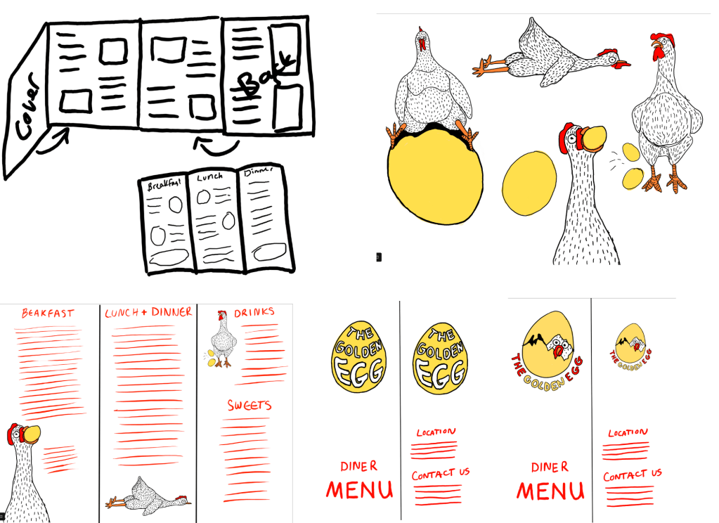
This project followed a research-driven design process focused on how diners can strengthen their connection to the community. The visual identity and brand applications were developed to highlight friendliness, accessibility, and trust, with playful design elements that echo the “Golden Egg” name. From logo creation to menu design, each touchpoint was crafted to feel approachable and consistent, reinforcing the diner’s promise of familiarity and quality. Careful attention was given to combining nostalgic charm with modern clarity, ensuring the brand resonates with both longtime residents and new visitors.

Visual Brand Strategy:
The branding strategy for The Golden Egg Diner is centered on warmth, familiarity, and playful charm. The logo—a golden egg perched on chicken legs—captures both humor and nostalgia, instantly signaling comfort food and a lighthearted dining experience. The visual identity uses bold typography and a sunny yellow palette paired with rich reds and earthy neutrals to evoke energy, appetite, and approachability.
Illustrations of hens and eggs are integrated across menus and brand collateral, adding personality while reinforcing the diner’s core theme. Clean layouts and consistent design elements ensure that the brand feels professional without losing its friendly, down-to-earth character. This combination of humor, simplicity, and warmth creates a brand experience that is memorable, inviting, and perfectly suited for a community-focused diner.
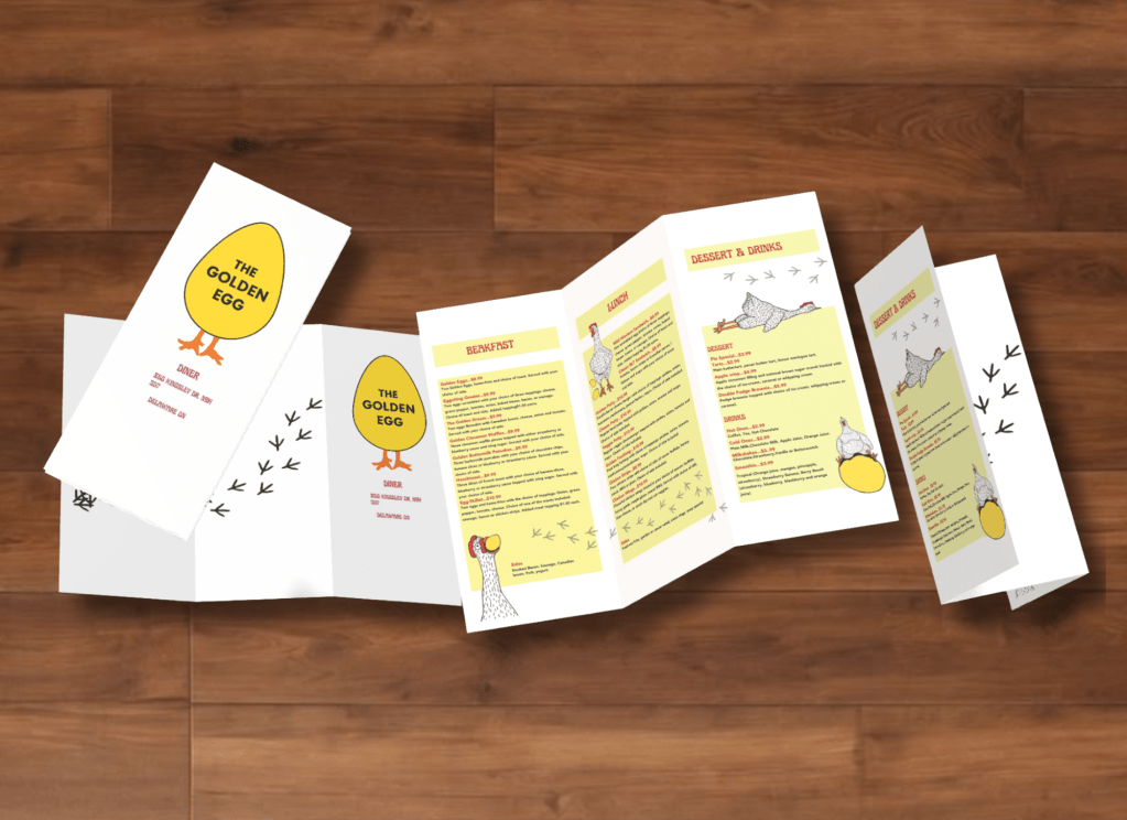
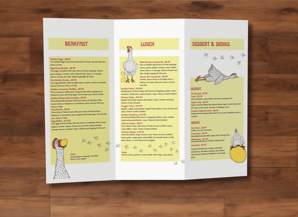
Menu Design:
The menu design for The Golden Egg Diner reflects the brand’s playful yet approachable identity. A bright yellow and warm red palette is paired with clean typography to ensure clarity and readability, even in a busy dining setting. Illustrations of hens, eggs, and subtle footprints are used throughout as lighthearted accents, reinforcing the diner’s theme while keeping the design fun and memorable. Organized into clear sections—breakfast, lunch, and dessert & drinks—the layout prioritizes accessibility, allowing customers to easily navigate their choices. The balance of personality and practicality ensures the menu feels inviting while maintaining a polished, professional standard.